
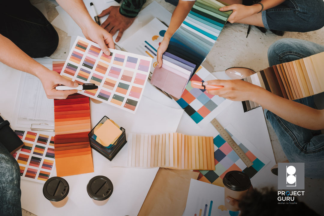
When it comes to home interior design, it’s all about creating a colour scheme for the space. Colour schemes in interior design refer to how colours are organised and chosen to adorn a space. People’s perception of a space can be affected by colours and their combinations.
Colour schemes can create a mood, accentuate a particular style, and bring contrasting things together. In many cases, colour schemes are used to create a visual link between two or more adjacent areas or rooms. Whether you enjoy interior design as a hobby or looking for home renovation ideas to keep your home looking presentable, we share the five colour theory basics that you should equip yourself with.
1. Using the colour wheel
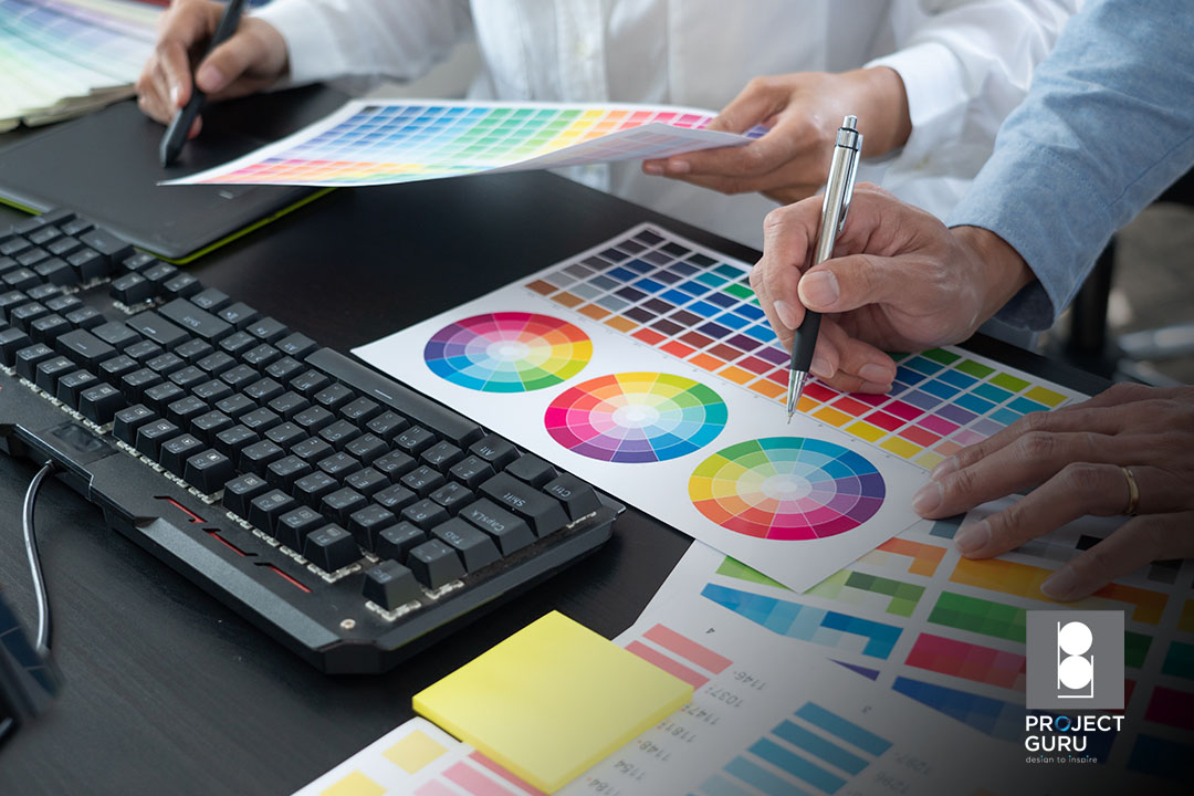
The colour wheel shows which colours blend well together, essentially taking all the guesswork out of the equation. Although most models consist of 12 colours, the colour wheel could theoretically be expanded to include an infinite number of shades. If you still aren’t familiar with the colour wheel, don’t fret since there are many ways to access it digitally. The Paletteton website allows you to design your own colour scheme from the comfort of your computer, and ColorSchemer offers the same features in a mobile app.
2. Basic colours – Primary, Secondary, Tertiary
If you have no idea where to start when it comes to decorating a colourful modern interior design, one of these 12 suggestions can be a good place to start. Choose one and it will help you narrow down your options until you arrive at the perfect shade.
- Primary: Red, blue, and yellow. These colours cannot be made by mixing with other colours.
- Secondary: Orange, Purple, and Green. These colours can be made by blending the primary colours together.
- Tertiary: A combination of primary and secondary colours.
3. Changing colours with neutrals
When you choose a basic colour, it’s easy to create many versions of it within the same group. The only thing you need to do is combine the colour with a neutral in order to make it lighter or darker. In modern interior design terms, this is referred to as a tint, shade, and tone.
- Tint: The addition of white to a colour to lighten it.
- Shade: The process of darkening a colour by adding black.
- Tone: The addition of grey to a colour to make it darker.
4. Identifying colour temperature
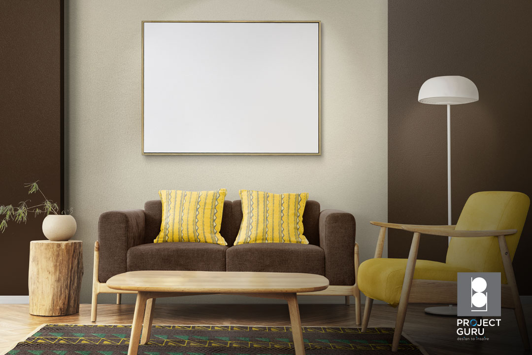
A colour’s temperature describes where it falls on the colour wheel. Colours like red, orange, and yellow are often referred to as warm colours. They tend to be more vibrant and appear to add a sense of liveliness and intimacy to an area.

On the other hand, blue, purple, and green are cooler colours. Using these colours can bring a calm, tranquil feeling into a room. When choosing the colour temperature of a space, it is also necessary to consider its size. Warm colours might feel claustrophobic in a tight space. However, cool colours can create a feeling of emptiness in a large room. This will help you to determine your colour scheme choices when you are brainstorming your home renovation ideas.
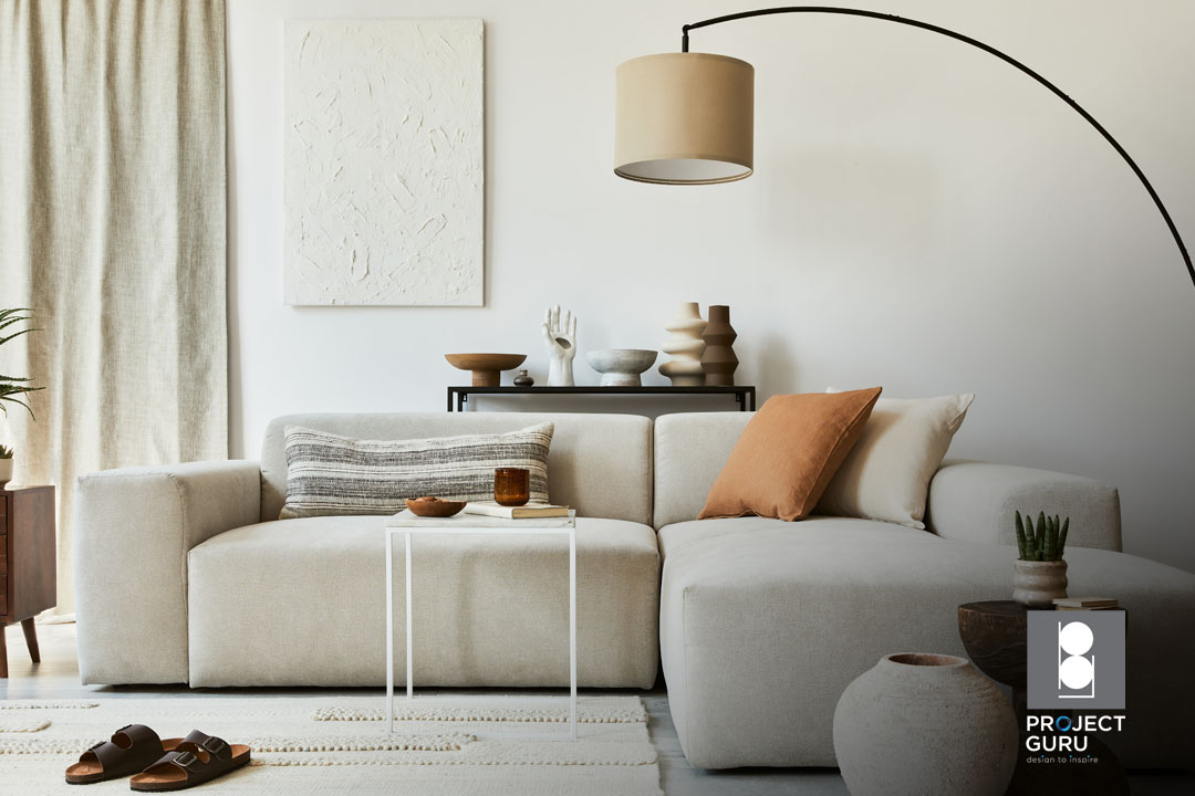
5. Complementary colour scheme
Complementary colours are the easiest to work with. They are made from adjacent colours on the colour wheel. Typically, one shade dominates and the other serves as an accent. Combinations such as red and green, blue and orange, and yellow and purple fall under this category. Due to this colour combination’s high contrast, it is best used in small doses and as a way to draw attention to a specific design element. In order to achieve a complementary colour scheme for your modern interior, you need to embrace neutral colours. This will help keep your eyes relaxed and prevent you from becoming overwhelmed in the room.
Choosing The Right Colour Scheme With ProjectGuru
We hope that this article has enlightened you on the basics of interior design colour theory. With this knowledge, you can make a more informed decision when narrowing down your home renovation ideas. If you need professional home interior design advice, feel free to reach out to our design experts here at ProjectGuru.
ProjectGuru is an interior design firm based in Singapore, specialising in creating design solutions tailored to your specific needs. Contact us today to find out more about what we do.